Product
Launch Week 1
Jan 12, 2026

Monday: Launch Week
Over the past several weeks, Phrasing has changed in some pretty dramatic ways. Most of the updates took several weeks to roll out, and required weeks of testing from our bravest of users. I didn't want to publicize the changes until they were ready, and so I now find myself with a lot of exciting stuff to share at once.
What better way to share it all than with a launch week!
Each day this week I'll be covering some features already live in Phrasing, and discussing them in some more detail.
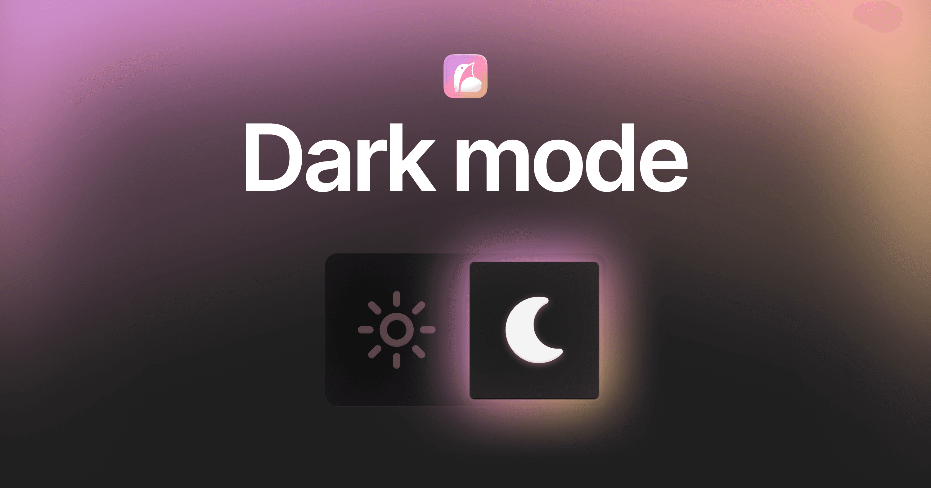
Tuesday: Dark Mode
Perhaps the most requested feature, I'm happy to say that Phrasing finally has a dark mode. This was a huge challenge for three main reasons:
There is a requirement of PWAs to use a pure black background if you want it to appear fully native
Most of the UI patterns absolutely do not translate to dark mode
It's just a massive surface area to test
The limitations
This left me with the limitations, and it was time to get to work. First up was the pure black limitation. See when you're doing reviews in Phrasing, I've used basically every pixel I can. I want to show you as much information as possible, without overwhelming you. I want you to be able to perform the most amount of actions in the least amount of taps, without cluttering up the screens. It needs to work for short expressions, long expressions, and three translation expressions. The entire experience is one giant balancing, which means those few pixels in the status bar at the top of the screen? Yeah, we need those.
However, on iOS, those pixels are either pure black or pure white in a PWA. That color is defined by the operating system, based on the time of day. This means that if I want to hide them, and use them as some padding in my UI, I need to match the color. That means a pure black background in dark mode.
To me, that's why I had to go pure black. But there's another reason that I wanted to go pure black. OLEDs.
I will often use Phrasing right before I go to bed, and first thing when I wake up. That's a terrible time to blast your retinas with light (you know, as opposed to the good times to blast your retinas with light). If I can make a pure black background look good, I can half the amount of pixels screaming into my retinas; and to me, that's what dark mode is all about.
The gambit
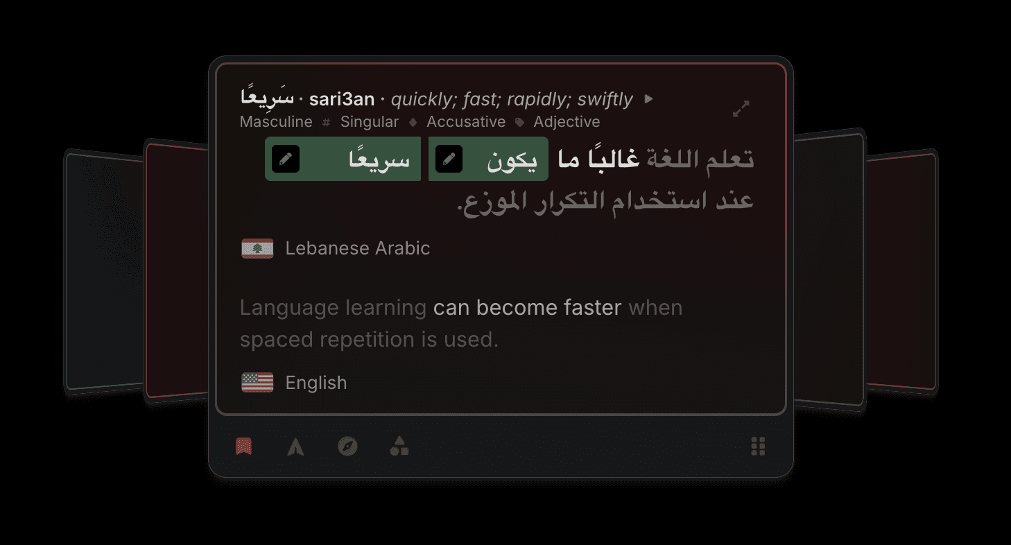
The next thing I had to figure out was what on earth to do with the polaroid concept. See, Phrasing has these animated, gentle, undulating gradients that help indicate which language a card is in. I'd tried many times to convert them to dark mode, but frankly, they just looked awful. Just awful:
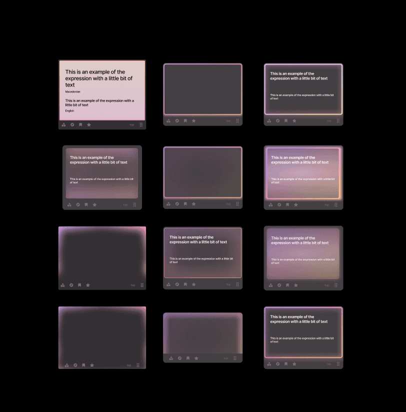
and to think, these were the ones I kept… you don't want to see the ones I deleted
How in the world do you add dynamic animated color to a dark element without distracting from the text? I had to learn more about light. After trolling twitter (x?) I stumbled across this image:
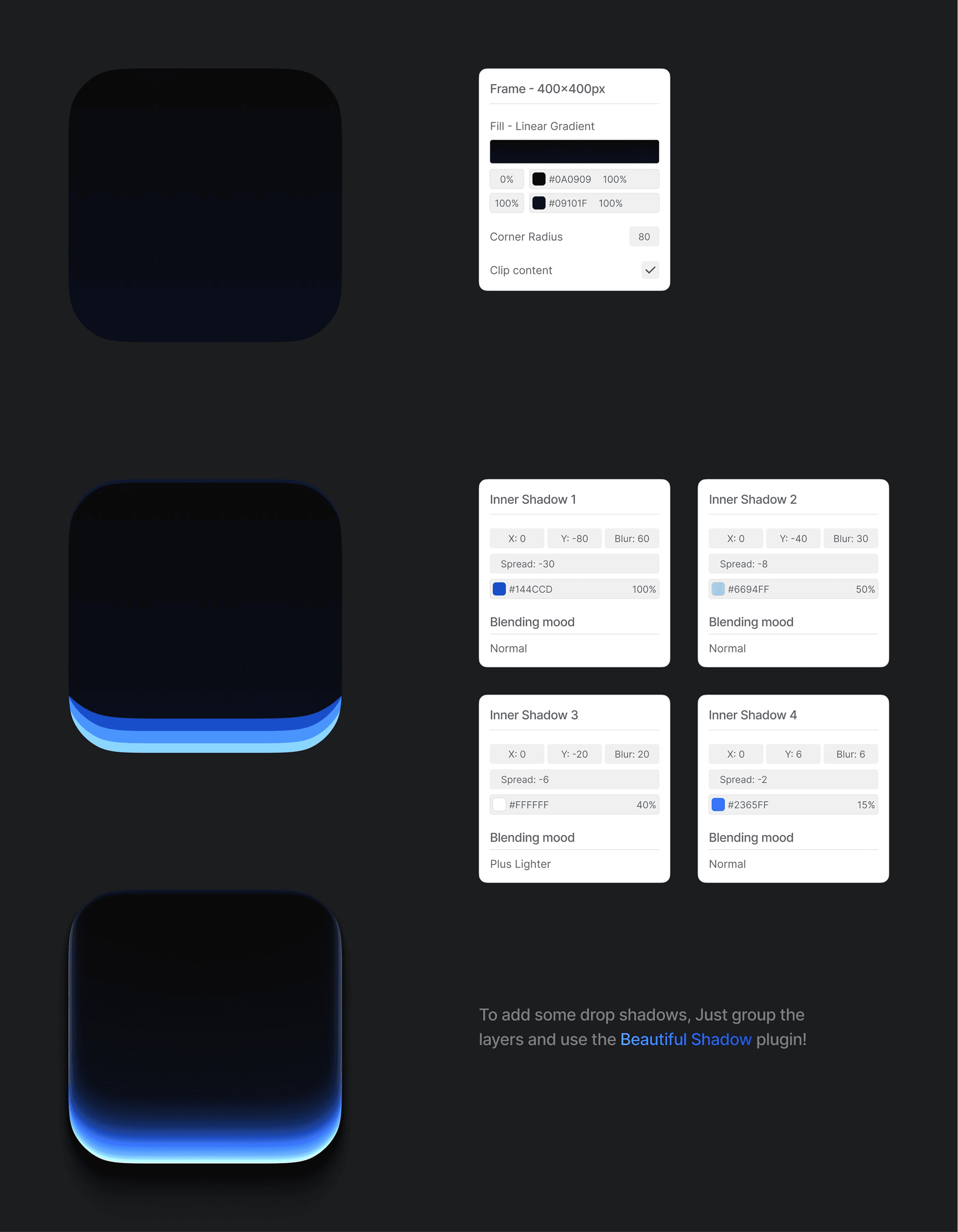
I'm really sorry, I did not save the source of this. I believe it's https://x.com/munzir_designs ? If you know the author of this post, please let me know!
This really helped me personally - I needed not just a gradient, but multiple gradients, with multiple intensities (luminosity x chroma). I may not be able to design good, but I can program good, and these sound like sliders to me!
So I set off to create three layers, all with the same hue, that have configurable intensities and blurs. After days of tweaking, I finally arrived at what I call Tokyo Night:
https://x.com/barrelltech/status/1999197344558977186
I didn't actually keep the flicker but it really adds to the Tokyo Night vibe
The millions of other little things
Once I had the polaroid component down, all I had to do was the rest of the application:
Of course the colors I had looked way to vivid and oversaturated in dark mode, so with the power of oklch and math, I came up with new colors palettes with dramatically reduced chroma in dark mode.
Of course I don't want to use stock tailwind grays, so I had to come up with my own gray palette with just a hint of purple.
Of course none of the color stops that worked in lightmode are sufficient now - the relative jumps between each tier were way to extreme, so I had to interpolate all of the color stops across the whole application.
Of course all the flags looked eye-bleedingly bright, but thankfully a quick desaturate and darken worked pretty universally.
Of course default contrast rations no longer worked, so almost every text element needed restyling
Of course the markdown parser didn't use variables, so I had to customize that
Of course when changing the variables, the UI wouldn't actually update all the time, so I had to manually re-render everything on theme change.
Of course all the assets, all the graphs, all the charts, all the shields, all the isalnds, and all the everything needed to be remade
Highlighting of the phrases also could no longer work, so now I had to find new ways to communicate the same information. By playing with text color, instead of the background, I was able to communicate everything I needed (with a bit of help from underlines).
I think you get the picture
The result
After weeks of development (alongside other tasks) I finally released dark mode and used it all day. Was it great? Was it terrible? What had I done?
I was still plagued by uncertainty until that evening, when I used Phrasing in the dark on an OLED display for the very first time — and it was awesome. The reduced eye strain was palpable. I just stared at the screen, truly surprised by the difference the pure black background made.
The only downside now is I find it much easier to fall asleep, making it harder to stay up late grinding. But I think that's a tradeoff I'm willing to make.
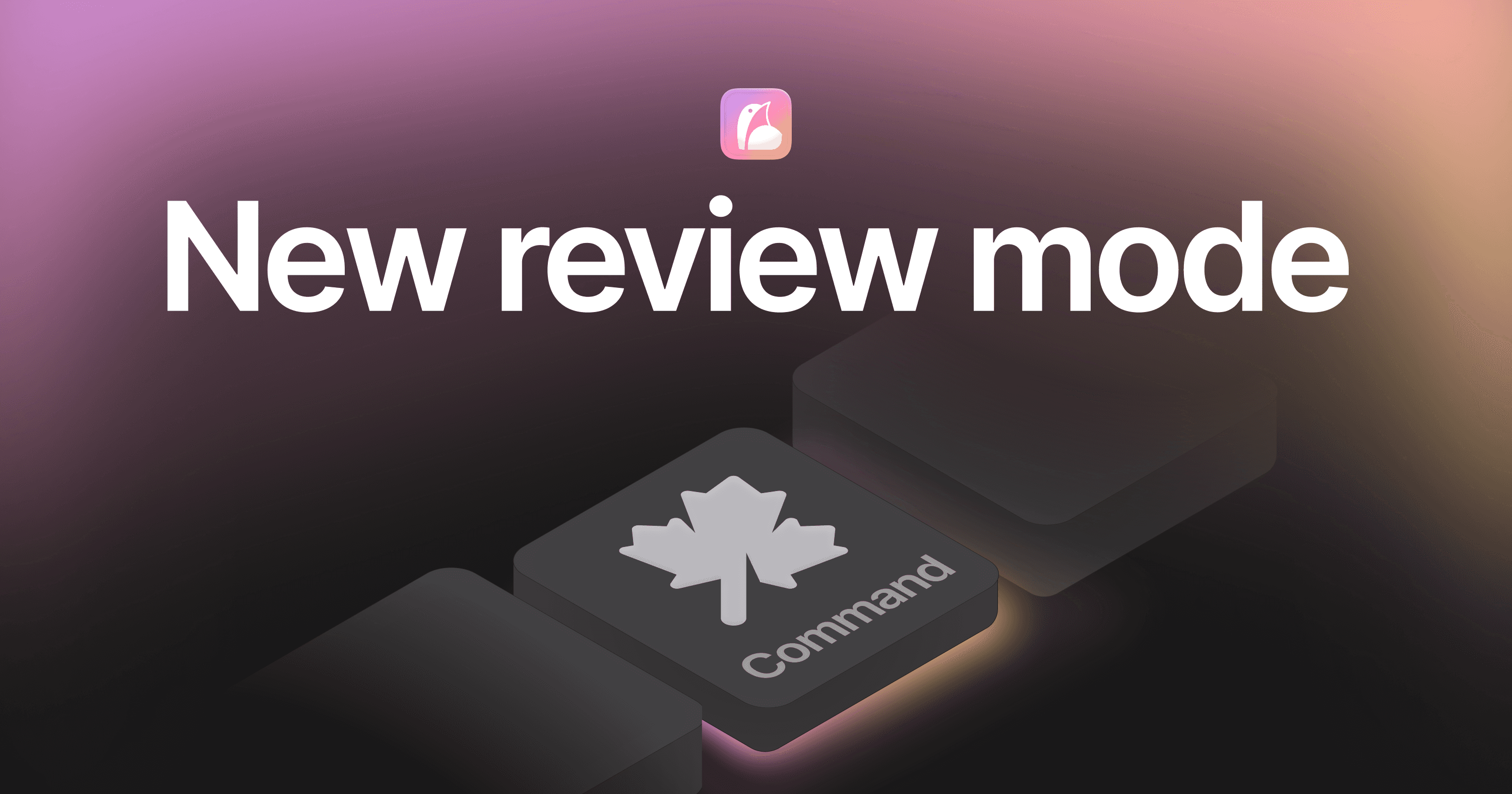
Wednesday: Command modality
Phrasing supports various ways to review content, called learning modalities, and the Command modality is the latest addition, touting a higher efficacy, better performance, and a new data model unlocking even more options in the future. It's a unified review modality, and is the spiritual successor to two of the previous modalities (clozeword and flashcard).
With command mode, you start by learning one word at a time. You can type this word in if you'd like, or use the buttons/keyboard shortcuts to manually assign reviews. As you learn, you'll start to be tested on two words, then three words, up to entire phrases.
Phrases: they're in the name
Since the beginning, a big goal of Phrasing was to work with phrases. I mean, it's literally in the name. Yes you can translate words, and yes you can make sentence cards, but we as humans don't treat language as a collection of either of those. We see language as a never ending stream of phrases.
When I launched the application, it's fill-in-the-blank (aka cloze completion) learning modality was called "Clozeword". This was because I always intended, one day, to support "Clozephrase".
Over the past few years, the rest of the application has progressed enough to finally reliably support this. And even better, the SRS is mature enough that it can decide the optimal number of words based on your level, performance, and history.
Combining with flashcards
Previously, I had two separate modalities for typing in your responses (clozeword) and using buttons to indicate your recall (flashcard). I always saw it as one high effort, high reward modality vs one medium effort medium reward. For me, I've learned a language nearly entirely through cloze completion, making more progress in hundreds of hours than the thousands of hours I've put into anki with non-cloze reviews.
Naturally, I therefor assumed that cloze-completion was just superior to grade-yourself. It's more effort, and it worked for me, so it must be better. But Phrasing is research-based, and as it turns out, always question your assumptions. Looking into the research, I found that cloze-completion reviews underperform or matched non-cloze reviews ~80% of the time.
However, there are clear cases where cloze-completion (actually typing in the answer ahead of time) is superior. And so I decided to combine these two methods of learning.
If you definitely do or do not know the word, just use the buttons. They're faster, and the benefit of typing it out is likely outweighed by the benefit of doing more reviews.
If you maybe know the word, or if you got the word wrong, type it out. If you know all the sounds but aren't sure what order (was it topapo? potapo? patoto?) or if you got the word wrong twice in one day, definitely type it out.
Making it go fast
One of the problems with an SRS that in as reactive as Phrasing's Humane SRS, is that every single review can effect the likelihood of hundreds of other cards. There's no way to precompute even a single review, let alone an entire review session.
This means that when the user clicks next, you have just a few milliseconds to determine the next card. And when the library starts to grow to thousands of expressions, it turns out that starts to not just cause a delay when clicking next, but actually start using a serious amount of battery on mobile devices.
Add into the fact that now not only is each individual word reviewable, but any word in also reviewable with it's neighbor, it's two neighbors, three neighbors, etc. A single expression might generate literally thousands of reviews to consider.
And so the entire SRS was rewritten to work in a single loop. One single reduction, looping over millions of options, using aggressive short-circuiting and some standard caching to stay single-digit millisecond in operation. No nested loops, no wasted calls. Nested loops turned to set lookups turned to bitmasks. Every extra function and instantiation was stripped out. Everything was written in the rawest javascript I could come up with, and aggressively benchmarked every step of the way.
And the result was dramatic. Theres no lag whatsoever to determine a next review. The battery usage plummeted, and finally, after years of development, using Phrasing costs doesn't have a noticeably higher drain on your battery than any other phone activity.
Preparing for the future
I've now been building Phrasing for over 10,000 hours - I'm not sure what that makes me an expert in, but apparently it's something. One thing I've learned a lot about are all the edge cases of building an SRS. There are lots of review modalities I'd like to add this year - those dedicated to help with gender, case, chinese characters, and so much more.
So while I'm redoing everything, why not also update the data structure so these enhancements in the future can integrate seemlessly?
All together
Command mode is a culmination of years of effort, all packed into a crazy month of development. It's fast, efficient, and wildy effective. It's so much more effective to be tested on multiple words, and using it for cloze-completion or self-assessment depending on the review feels natural and aggressively cuts down on my review time.
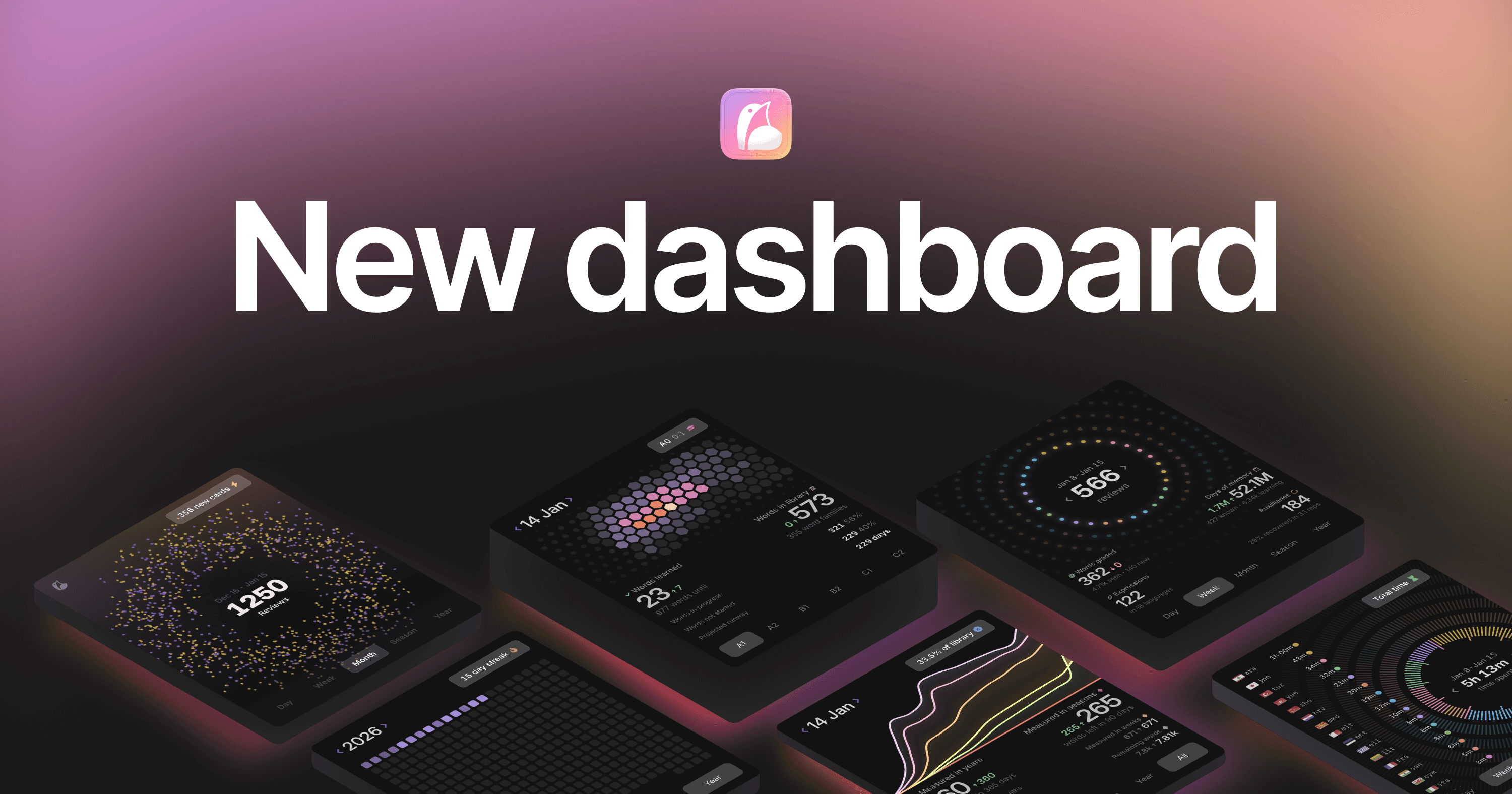
Thursday: Analytics
I've had analytics in Phrasing for a while, but they were always significantly more lackluster than the rest of the application. I've also long had this dream/idea of the current dashboard, with these swipe-able cards… and while that worked for a while, I was always at the whim of the charting libraries, and constantly fighting an uphill battle against performance.
On a personal note as well, after seeing my old analytics for over a year, I developed an intense aversion to donut graphs in squares.
And so I set out to rewrite all of the new analytics in WebGL. I figured I would rather crashes and bugs be *my* fault, more than the browsers fault. I'd also rather performance constraints be device constraints, not browser constraints.
Over the past few weeks, I redesigned all the dashboard analytics into WebGL. Custom rendering logic was made and custom graphs were designed. And I'm so happy with how they turned out. There's too much to cover, but let's go over the my 3:
Current level
Shamelessly inspired by @alien_pixels, this shield shows your current level against various different CEFR levels. It's such a perfect visual for your progress, and shows some other critical information I've been missing for a while, like how long until you exhaust your current library.
Hopefully I "made it mine" well enough, as I'm extremely proud of it!
Review Breakdown
This one is my "pie-chart-but-not-a-pie-chart" has two noteable points:
Every single review you do is "animated" - or at least, it has a designated position. Instead of manually managing what should be rendered and what shouldn't, I store everything in one array, and let WebGL figure out what to animate. Even with hundreds of thousands of reviews, it still renders with 60fps. How metal is that?!
The "days of memory" is another one of my current pride and joys. You know how every word/review has a forgetting curve, right? Well, days of memory is the area under all those curves combined. That's right. 20 years later and I finally actually used calculus!
Leaderboard shield
This one is actually very interesting to me for howmuch it fails at what it's supposed to do. The graph on the right is another pie-chart-that's-not-a-pie-chart. Yet it is shockingly horrible it visually communicating the information! This shield only launched because of how much I liked the left hand side of it.
It was an interesting deep dive into what makes graphs readable. No amount of tweaks to line size, spacing, color, etc made this graph readable. Even a zero pixel gap!
I like the design, and it came out relatively like I imagined. But it's missing the ability to visually communicate the information. But at this point, I'm taking it as a challenge / learning oppurtunity. I'll figure this one out eventually! For now, it looks nice, and the leaderboard on the left compensates.